How To Make Instagram’s New Algorithm Work For Your Brand

Earlier this month Instagram dropped a bombshell that it will be introducing an algorithm to display posts they feel are most relevant to that user.  Since then, many brands and agencies we’ve spoken to have been panicked in what they feel will impede their ability to reach and grow their follower base.

notificationsWe’re here to tell you that yes, the change could potentially impact the number of users seeing your posts but you can also leverage it to work for your brand with these 3 tips –

  1. Post Quality Content – This is the single most important thing you can do to guarantee your followers see your posts.  Engaging images that encourage users to interact with your content ensures your future content will appear at the top of their feed.
  2. Work With Influencers – This is the one group group that is sure to benefit from the new algorithm.  Influencers typically have the highest rate of engagement from their followers and by working directly with them, you can use that engagement for your brand.  They key is learning who the potential influencers are for your brand and fostering a long term relationship with them.
  3. Pay For Promoting – It’s no secret that the ultimate goal of implementing the algorithm is to generate revenue.  You could look at this update as Instagram improving their advertising platform and use it as an opportunity for your brand to begin promoting on Instagram.  We suggest analyzing which of your posts received the most engagement and experimenting with a small advertising spend.

Interested in running an Instagram campaign for your brand? Plans start at $29/month and you can cancel anytime! Sign up free to check it out!

Share

New Product Release: Design Themes And Backgrounds

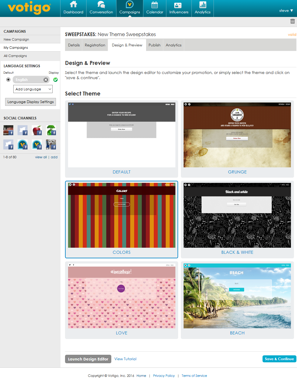
We’re pleased to announce the release of Design Themes to the Votigo platform featuring 5 themes and 21 backgrounds currently available for the following campaign types:

  • Sweepstakes
  • Viral Sweepstakes
  • Instant Win
  • Trivia Sweepstakes
  • Viral Trivia Sweepstakes
  • Sign-up Form

Each theme utilizes unique fonts, backgrounds and colors.  Giving your next promotion a custom look and feel has never been easier!

Step 1: Select Your Theme

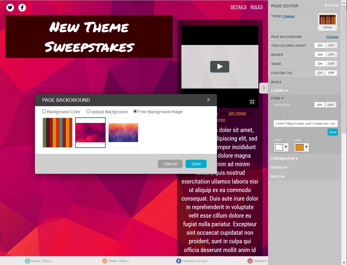
Select ThemeStep 2: Launch The Design EditorDesign EditorStep 3: Customize – Select a different background, change the color of your text, add videos and more!

Customize

Share

12 Templates for Small Business to Save Time and Money

As a small-business owner, you know all about the “time = money” equation. You’ve spent hundreds of hours doing work to avoid paying someone else for it (and often gathering less than minimum wage yourself!)

From first-day launch to daily operations, there are a ton of resources out there to help you save both time and money! Here are 12 templates and tools that will streamline operations and give you the time to invest in more important areas of your business.

1. Business Plan Maker

If you’re just starting out, you need a business plan. Check out this tool, offered by the U.S. Small Business Administration. It goes step by step through the components of a business plan and offers guidance along the way, saving you time from writing one from scratch. If you plan to apply for a loan, you’ll need a business plan to show how you plan to be successful.

2. Slogan maker

Here’s a fun one! If you’re trying to think of a catchy slogan for your business, spark some ideas with this tool. It’s all automated, so the ideas it spits out may seem corny – but they’re useful because they can snap you out of your brain block (especially if creativity doesn’t come to you naturally!)

3. Business Cards

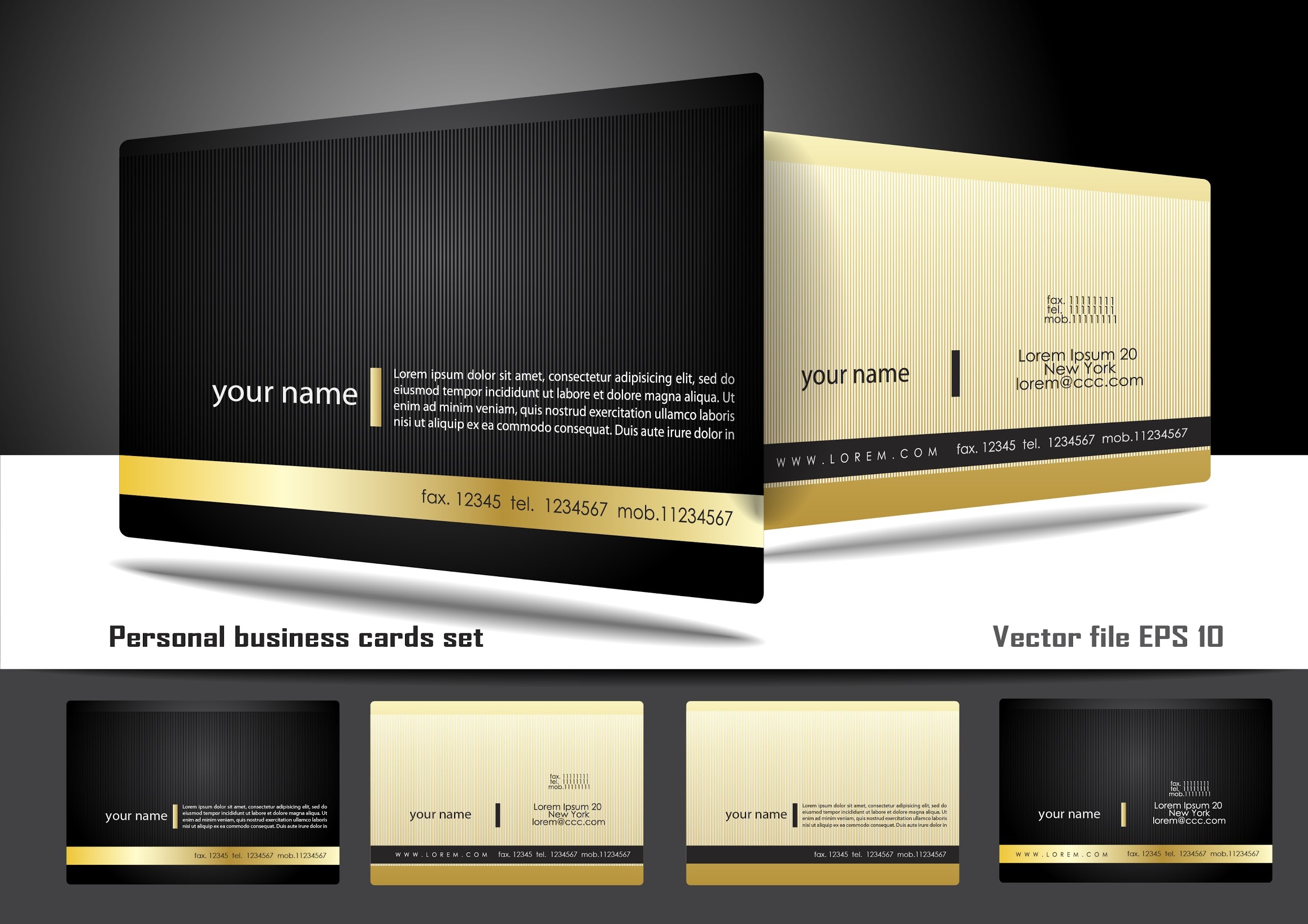
It’s incredibly fast, easy, and cheap to design business cards online. You can do it all from scratch or use an existing template.

business-cards

4. Basic Bookkeeping Template

This template is useful for small businesses that don’t already have a professional bookkeeper. Easy to understand, it has one sheet for sources of income, one for expenses, and one to track cash flow. It’s quick to plug in the numbers and be done.

5. Professional Budget Template

This template is an in-depth budget spreadsheet for the business that’s beyond basic. All you have to do is plug in planned and actual expenses and get an automatically updated report that includes pie charts and graphs done for you!

6. Financial Projections Template

This in-depth form is helpful for any business venture. It can help you figure out startup costs, forecast sales and cash flow, and even calculate employee payroll, benefits, and withholdings. When you keep your financial records well-organized, you lower the risk of costly mistakes.

7. Loan Amortization Schedule

Amortization calculators are fun tools that show you what your loan looks like. Have a little extra cash this month? How would it affect your loan if you applied it to the principal? See immediately how much you would save in interest over the life of the loan. Calculate whether you can afford to pay the loan off early. Always be thinking in the back of your mind about how best to pay off your loan – and look forward to the day when your business will be debt-free!

8. Invoice Template

This is a simple, professional-looking invoice template (because you want to look professional when you’re telling people they owe you money.)

9. Inventory Management Form

If you run a business selling a tangible product, keeping track of inventory is essential! You need to know what you have in stock so you can fulfill future orders. You also need to track your inventory to report to the IRS when tax time comes.

lady-inventory

10. Project Management Template

This template allows you to use Excel to track the progress of your project. It’s essentially a tool to plan the objective, schedule, task list, employees involved, costs, risks, and other data.

11. Employee Schedule

To help you keep organized, use this standard employee schedule. At a glance, you can not only see which employees are scheduled, but how much they are making and how many total hours they are working.

12. Customer Satisfaction Survey Form

This is a basic customizable form to give you some ideas about what you might want to put on a customer satisfaction survey. Once you’ve edited it to best reflect your business, you can simply print it off, ready to be filled out by the customer.

Time = money. By using all the resources available to you, you’re essentially hiring the internet to work for you for free. These tools save you money, and they save you time – time to drive your business forward without slowing down for anything!

This article was originally written by Nick Rojas for the Heyo Blog.

Share

4 Tips For Creating An Annual Promotions Calendar

Each year there are dozens of opportunities to create a promotion, whether it be holidays, seasons or annual events.  Having an annual promotions calendar allows you to effectively strategize and market each promotion while keeping your community continually engaged.accuweather

Let’s review 4 tips to help you begin planning your 2016 calendar.

  1. Determine the number of promotions you would like to run.  You’ll want to ensure that your company has the resources to manage each promotion.  Large organizations with a full social media team may have the capacity for weekly promotions while a small business would benefit from running bi-monthly campaigns.  As a rule of thumb, we believe that one promotion per month is a good place to start.
  2. Start with holidays.   Build your promotions around holidays such as Independence Day, Black Friday, Halloween, etc.   Focus on national holidays first and then incorporate others that appeal to your business such as retail holidays.
  3. Complement your current marketing schedule.  Take a step back to review your other objectives this year and plan promotions to complement those activities.  If your company has existing promotions on the schedule, adding in a contest or sweepstakes is a great way boost their performance.
  4. Don’t forget about the seasons.  Back to school campaigns at the start of fall, cold weather themed winter promotions, starting new in the spring and beating the heat of summer are all opportunities to engage with your community.
Plans start at $29/month and you can cancel anytime! Sign up free to check it out!
Share

10 Inspiring Website Designs That Would Dominate in 2016

Design trends are timeless – they span several years to a decade depending on how well they’re received by the audience. However, in recent years, with the rapid development in technology, design trends are quickly changing with users’ interest. Businesses give top priority to the look of their website in order to gain a competitive advantage and attract more users.

Thanks to the increasing number of online graphic tools, last year we saw at least a dozen designs dominate the web world. From card-style layouts to video headers to tiny animations, web designs grew in popularity. This year, we could see some of them continue their domination and a few new ones as well. Let’s take a look at 10 website designs that could steal the show in 2016.

1. Vertical Scrolling

vertical_scrolling

With most people accessing websites on the go, it is estimated that mobile traffic could equal (or even surpass) desktop traffic in the coming years. Taking this into consideration, a lot of website owners are betting on vertical scrolling patterns. The thing about this type of design is, it makes web surfing a lot easier and leads to better user experience.

2. Card-like Interfaces

Card-like

Card-inspired templates are finding their way in websites, apps, and printed forms. The thing with card-type layouts is, they are easy to browse through, more engaging, and they present content in an engaging manner for users. There is no limit to creativity here – you can come up with your own design, shapes, and colors and mesmerize your visitors with your interface.

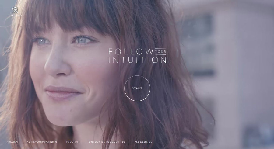
3. Video Headers
Video Headers

High speed Internet connections and people’s fondness to media-rich content have lead to the rise of movie-style videos in website headers. What better way to explain your business than use a short 2-minute video enriched with sharp images, captivating graphics, and nice background music?

4. Small Animations

Small Animations

Animations are getting smaller, but their popularity is getting bigger by the year. From subtle motion to data animation to guiding animation, there are lots of concepts to choose from. Most websites use tiny animations to provide an element of surprise to visitors once the page has completed loading. Brilliant animations are all about creating special effects to entice users to explore your content. Apple, Fleet Fleet, and Pixate are some of the popular sites that have used tiny animations to a great effect. You could check their sites for an idea!

5. Better Typography

better_typography

Bigger, bolder fonts are being preferred by a lot of websites because they work well with the other visual elements in the homepage and ultimately increase the readability of the content. Websites that use typography believe that combining readable typefaces with stunning graphics is a better way to deliver their brand message to the audience.

6. Illustration and sketches

Illustration and sketches

There is something with the idea of pairing digital designs with hand-crafted arts that never seems to bore visitors. Even a lifeless website comes alive with the use of eye-catching sketchings and drawings. From icons to clickable buttons to the other interface elements, using illustrations and sketches lets you give your users an enjoyable browsing experience.

7. Bold and bright colors

bold and bright

Using bright colors and bolder fonts on your homepage is a smart way to make the key area of your content stand out and be read by your audience. Desert Chill, Apigee, and Rainbow Nursery are some notable sites that have used the ‘magic of colors’ to their advantage. Please do check them out.

8. Own photos, not stock photos

9jvuikx

Stock photos are outdated and boring. A few sites have already started using their own photography for the sake of uniqueness and credibility. Take a look at Netflix, which delivers its brand message with its own photography in the background. Original images are more natural and authentic and we could see a lot of websites use them in 2016.

9. Collaboration Tools

collaboration_tools

It’s quite common that not all designers work at the same office – some work from home, some work at the office and clients are usually from different countries. This is where using real-time collaboration tools can make a difference. They make the web design process a lot quicker and easier. Even feedback can be received and applied in a professional manner. From our research, we found that Trello, Yammer, Red Pen, Invision, and GoVisually are some top collaboration tools for web designers.

10. Full-screen Forms

full-screen

With a huge amount of web traffic coming from mobile users, using full-screen forms in the homepage has become a regular practice in the industry. We saw a lot of websites use this approach effectively in 2015 and the trend is most likely to continue into 2016.

From searching an item to subscribing to newsletters to signing up, full-screen forms can come in handy. When used correctly, they enable users to focus more on their tasks.

Conclusion

So, which of these designs do you think will dominate in 2016? Which design will you prefer for your site? Please let us know in the comments. Thanks!

This post was originally written by Joyce Mason for the Heyo blog.
Share

3 Questions To Answer When Choosing Your Campaign Hashtag

One of the most important aspects to running successful promotions on Twitter and Instagram is the selection of your hashtag.  Let’s take a look at the first 3 questions to answer when choosing your campaign hashtag.

#PACK4PARADISESWEEPSTAKES

#PACK4PARADISESWEEPSTAKES

  1. Am I running a contest or sweepstakes?  The FTC updated their guidelines for running contests and sweepstakes on social media requiring brands to include “contest” or “sweepstakes” either within the promotion hashtag or as a it’s own hashtag.  For example, if we wanted to run a sweepstakes called #VotigoTrip we would also need to include #Sweepstakes in order for entries to be eligible.  Another option would be to use the single hashtag #VotigoTripSweepstakes.  Your brand can use either option with our multiple hashtag promotion builder
  2. Is my hashtag easy to remember?  When promoting your hashtag you’ll likely only have the attention of your potential entrant for a brief moment.  Having a long or complex hashtag could result on misspellings or the user forgetting it all together.  If you are giving away a big trip, it can be tempting to use #BrandHonoluluHawaiiTripOfALifetimeContest but you’ll be much better off simplifying that to #BrandHawaiiContest
  3. Has someone already used my hashtag? There’s nothing worse than launching a social promotion only to find out that another brand already used your hashtag.  If you’re using a simplified hashtag, we suggest including your brand’s name to ensure a competitor hasn’t used it previously.
Share

3 Promotion Ideas Guaranteed to Boost Customer Engagement

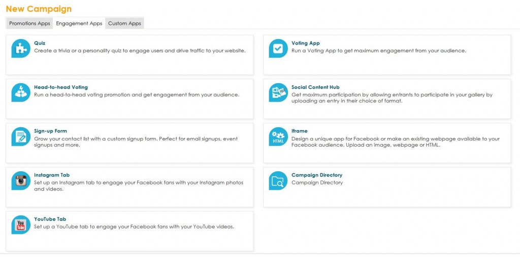
While promotion-oriented campaigns such as contests and sweepstakes are a great way to grow your audience, Votigo engagement apps are a great way to bring your audience deeper into your larger brand conversation. Today’s blog post looks at 3 promotion ideas guaranteed to boost customer engagement.

engagement apps

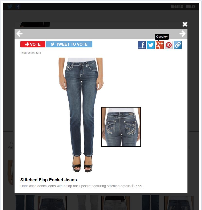
1.  Voting App

Through our Voting App, you can feature new products or gauge the popularity of an item in your product line in order to increase customer engagement.  Gordmans recently launched a Voting app in partnership with Earl Jean that encouraged fans to vote for their favorite jeans and win prizes!

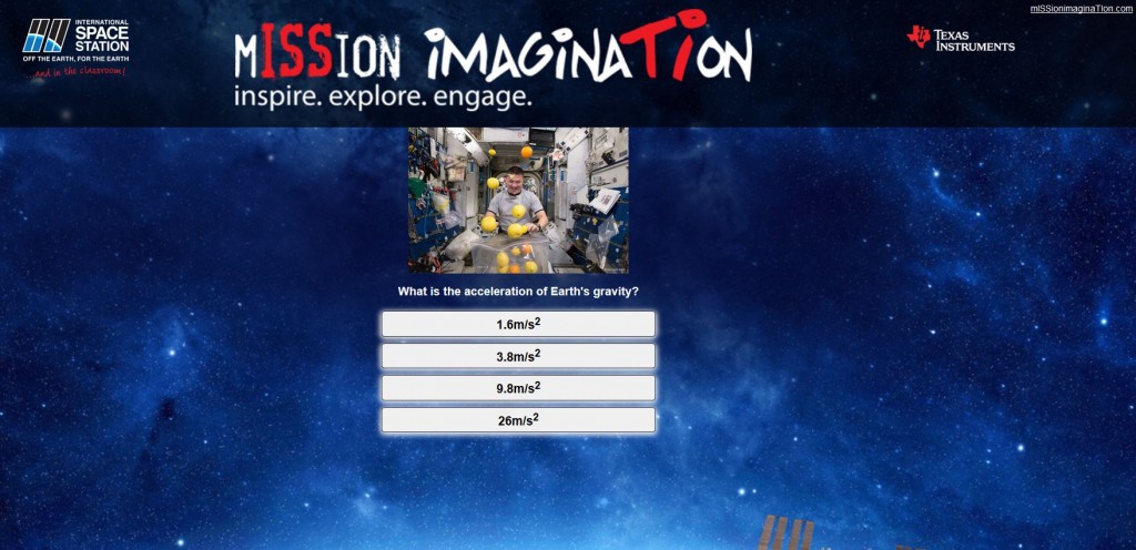
VotingApp2.  Quiz App

Trivia and personality quizzes are a fun way to learn more about your users, engage them in your brand conversation, drive traffic to your website or create product awareness.  Mission Imagination is a new trivia quiz promotion from the minds of NASA and Texas Instruments created to inspire the next generation of innovators, inventors and explorers by engaging them in the science, technology, engineering, and math (STEM).

QuizApp

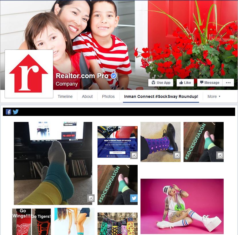
3.  Social Content Hub

Looking to regularly aggregate content while also boosting customer engagement?  Votigo’s Social Content Hub is a great always-on solution where users can submit photos, videos or essays into your gallery at any time.  Content can be submitted directly on the app or by pulling in content from social media.  Realtor.com is using #SockSwag to pull entries from Twitter and Instagram into their app on Facebook.

SockSwag

Share